Table of contents
In this article, I will solve a Acid Rain CSS Challenge on CSS Battle. Let's look at the problem first.
Problem
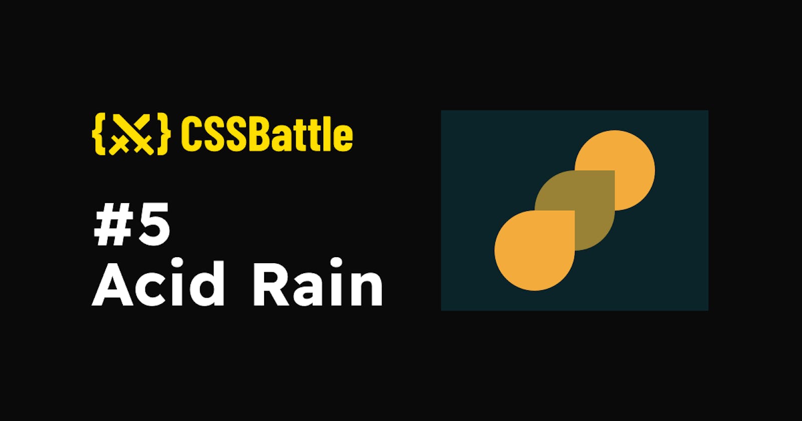
We need to create the following container by using CSS Properties only:

Solution
So now look at the Solution and how we are going to achieve this.
HTML
<div class="one"></div>
<div class="two"></div>
<div class="three"></div>
There are three divs, each one represents a single raindrop.
CSS
Now let's style the Body first.
body {
  margin: 0;
  background: #0b2429;
}
After doing that, we can style the raindrops.
.one, .two, .three {
  position: absolute;
  width: 120;
  height: 120;
  background: #998235;
  border-radius: 50% 0 50% 50%;
}
.one, .three {
  background: #f3ac3c;
}
In the above code, we are initializing the height and width of the raindrops to 120px and applying the border-radius property to make the perfect raindrop shape.
Now I'll define positions for all the raindrops individually with z-index.
The
z-indexproperty specifies the stack order of an element. An element with greater stack order is always in front of an element with a lower stack order.
.one {
  left: 20%;
  top: 50%;
  z-index: 11;
}
.two {
  z-index: 10;
  left: 35%;
  top: 30%;
}
.three {
  transform: rotate(180deg);
  left: 50%;
  top: 10%;
  z-index: 9;
}
This is all you need to solve this CSS Problem.
In CSS Battle you can use 100 instead of 100px. You don't need to define px in CSS. However, if you are using rem or % then you need to pass them separately. That's why in the above CSS code there are no units mostly. For more info visit here
Codepen
Alternate Solution
There could be many Alternative Solutions I've used this one because of the fewer characters and simplicity.
HTML
<p t></p>
<p m></p>
<p b></p>
Here I am using the <p> tag and inside them t stands for a top, m stands for middle and b stands for the bottom raindrop.
CSS
* {
  margin: 0;
}
body {
  background: #0b2429;
}
p[t],
p[m],
p[b] {
  position: absolute;
  width: 120px;
  height: 120px;
  background: #998235;
  border-radius: 50% 0 50% 50%;
}
p[t],
p[b] {
  background: #f3ac3c;
}
p[t] {
  transform: rotate(180deg);
  left: 50%;
  top: 10%;
  z-index: 9;
}
p[b] {
  left: 20%;
  top: 50%;
  z-index: 11;
}
p[m] {
  z-index: 10;
  left: 35%;
  top: 30%;
}
Minify the code or CSS by using any CSS Minifier. It helps you to reduce the characters in the code which will increase the score.
Wrapping up
If you like this then don't forget to ❤️ it. And I'll see you in the next article. See you soon.

