CSS Battle: #14 - Web Maker Logo

In this article, I will solve a Web Maker Logo CSS Challenge on CSS Battle. Let's look at the problem first.
Problem
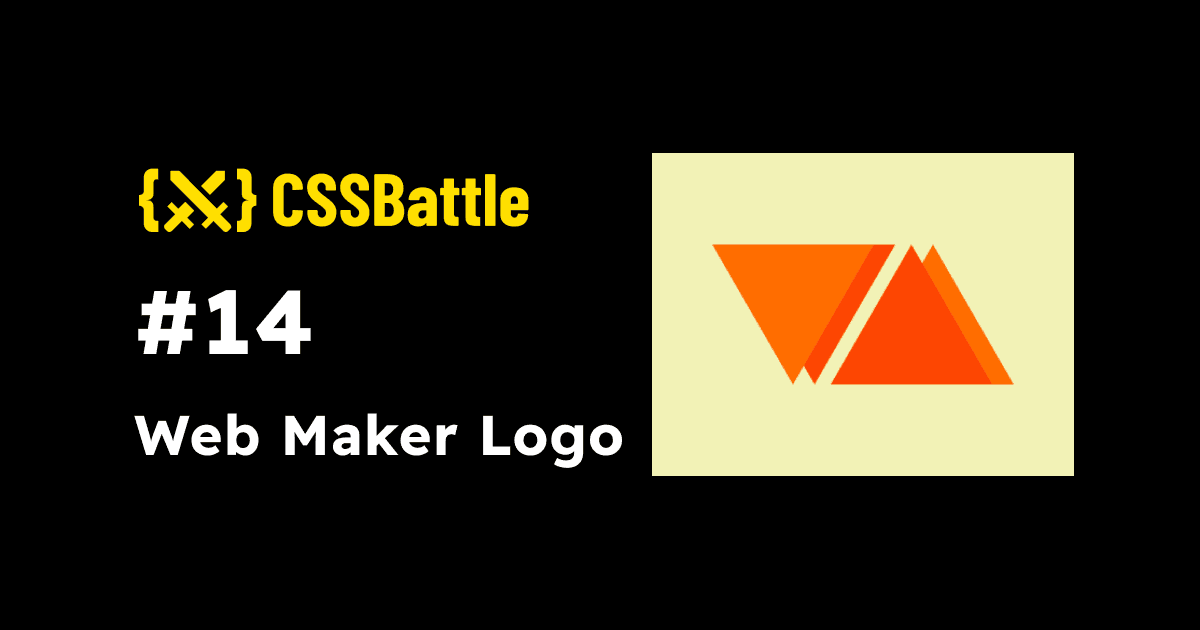
We need to create the following container by using CSS Properties only:

Solution
So now look at the Solution and how we are going to achieve this.
HTML
<div wl><p l></div>
<div wr><p r>
<div wl>: wrapper for left polygon<div wr>: wrapper for right polygon<p l>: Left polygon<p r>: Right polygon
CSS
Now let's style the containers.
body {
  margin: 0;
  background: #f2f2b6;
  display: grid;
  place-items: center;
}
p {
  position: fixed;
  width: 150;
  height: 130;
  clip-path: polygon(100% 0, 0 0, 50% 100%);
}

[wl] {
  filter: drop-shadow(20px 0 #fd4602);
}

[l] {
  background: #ff6d00;
  left: -140;
  top: -6;
}

[wr] {
  filter: drop-shadow(20px 0 #ff6d00);
}

[r] {
  background: #fd4602;
  transform: scaleY(-1);
  bottom: -6;
  left: -30;
}
I am using a wrapper because we cannot add box-shadow to the clip-path. However, If you wrap the clip-path in some div and then apply the drop-shadow then it works. That's what I did here.
Note: In CSS Battle you can use
100instead of100px. You don't need to definepxin CSS. However, if you are usingremor%, you need to pass them separately. That's why in the above CSS code there are no units mostly. For more info visit hereMinify the code or CSS by using any CSS Minifier. It helps you to reduce the characters in the code which will increase the score.
Minified Version:
<div wl><p l></div><div wr><p r><style>body{margin:0;background:#F2F2B6;display:grid;place-items:center}p{position:fixed;width:150;height:130;clip-path:polygon(100% 0,0 0,50% 100%)}[wl]{filter:drop-shadow(20px 0 #FD4602)}[l]{left:-140;top:-6;background:#FF6D00}[wr]{filter:drop-shadow(20px 0 #FF6D00)}[r]{background:#FD4602;bottom:-6;left:-30;transform:scaleY(-1)}
Wrapping up
There are many ways to solve this. You can share your approach in the comments. If you like this then don't forget to ❤️ it. And I'll see you in the next article. See you soon.


