# CSS Battle: #6 - Missing Slice
In this article, I will solve a [Missing Slice](https://cssbattle.dev/play/6) CSS Challenge on [CSS Battle](https://cssbattle.dev/). Let's look at the [problem](https://cssbattle.dev/play/6) first.
## Problem
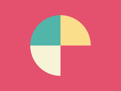
We need to create the following container by using CSS Properties only:
## Solution
So now look at the Solution and how we will achieve this.
### HTML
```html
```
I took three divs to create the shape. Each one of them represents a slice.
### CSS
Now let's style the body container first.
```css
body {
margin: 0;
background: #e3516e;
display: grid;
grid-template-columns: 1fr 1fr;
}
```
I have used a `grid` to layout the children. `grid-template-columns: 1fr 1fr` property defines that there should be two columns with `1fr`. Here `fr` represents a fraction of the available space in the grid container.
Now Let's style the individual slices
```css
.one, .two, .three {
width: 100;
height: 100;
}
.one {
background: #51b5a9;
border-radius: 100% 0 0 0;
place-self: end;
}
.two {
background: #fade8b;
border-radius: 0 100% 0 0;
place-self: end start;
}
.three {
background: #f7f3d7;
border-radius: 0 0 0 100%; /* top-left , top-right, bottom-right, bottom-left */
place-self: start end;
}
```
In the above code, you can see that I have used [place-self](https://developer.mozilla.org/en-US/docs/Web/CSS/place-self) in all of the slices. The `place-self` CSS shorthand property allows you to align an individual item in both the block and inline directions at once (i.e. the `align-self` and `justify-self` properties).
>Note: In CSS Battle you can use `100` instead of `100px`. You don't need to define `px` in CSS. However, if you are using `rem` or `%`, you need to pass them separately. That's why in the above CSS code there are no units mostly. For more info [visit here](https://cssbattle.dev/tips)
### Codepen
%[https://codepen.io/j471n/pen/abWZvOy]
## Alternate Solution
There could be many Alternative Solutions I've used this one because of the fewer characters and simplicity.
### HTML
```html
```
Here `f` stands for the First slice, `s` stands for the Second slice, and `t` stands for the third slice.
### CSS
```css
* { margin:0 }
body {
background: #e3516e;
display: grid;
grid-template-columns: 1fr 1fr;
}
p[f], p[s], p[t] {
width: 100;
height: 100;
}
p[f] {
background: #51b5a9;
border-radius: 100% 0 0 0;
place-self: end;
}
p[s] {
background: #fade8b;
border-radius: 0 100% 0 0;
place-self: end start;
}
p[t] {
background: #f7f3d7;
border-radius: 0 0 0 100%;
place-self: start end;
}
```
## Tip
>Minify the code or CSS by using any [CSS Minifier](https://www.minifier.org/). It helps you to reduce the characters in the code which will increase the score.
## Wrapping up
If you like this then don't forget to ❤️ it. And I'll see you in the next article. See you soon.