


Table of contents
In this article, I will solve a Missing Slice CSS Challenge on CSS Battle. Let's look at the problem first.
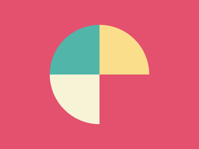
Problem
We need to create the following container by using CSS Properties only:
Solution
So now look at the Solution and how we will achieve this.
HTML
<div class="one"></div>
<div class="two"></div>
<div class="three"></div>
I took three divs to create the shape. Each one of them represents a slice.
CSS
Now let's style the body container first.
body {
  margin: 0;
  background: #e3516e;
  display: grid;
  grid-template-columns: 1fr 1fr;
}
I have used a grid to layout the children. grid-template-columns: 1fr 1fr property defines that there should be two columns with 1fr. Here fr represents a fraction of the available space in the grid container.
Now Let's style the individual slices
.one, .two, .three {
  width: 100;
  height: 100;
}
.one {
  background: #51b5a9;
  border-radius: 100% 0 0 0;
  place-self: end;
}
.two {
  background: #fade8b;
  border-radius: 0 100% 0 0;
  place-self: end start;
}
.three {
  background: #f7f3d7;
  border-radius: 0 0 0 100%;      /* top-left , top-right, bottom-right, bottom-left */
  place-self: start end;
}
In the above code, you can see that I have used place-self in all of the slices. The place-self CSS shorthand property allows you to align an individual item in both the block and inline directions at once (i.e. the align-self and justify-self properties).
Note: In CSS Battle you can use
100instead of100px. You don't need to definepxin CSS. However, if you are usingremor%, you need to pass them separately. That's why in the above CSS code there are no units mostly. For more info visit here
Codepen
Alternate Solution
There could be many Alternative Solutions I've used this one because of the fewer characters and simplicity.
HTML
<p f></p>
<p s></p>
<p t></p>
Here f stands for the First slice, s stands for the Second slice, and t stands for the third slice.
CSS
* { margin:0 }
body {
  background: #e3516e;
  display: grid;
  grid-template-columns: 1fr 1fr;
}
p[f], p[s], p[t] {
  width: 100;
  height: 100;
}
p[f] {
  background: #51b5a9;
  border-radius: 100% 0 0 0;
  place-self: end;
}
p[s] {
  background: #fade8b;
  border-radius: 0 100% 0 0;
  place-self: end start;
}
p[t] {
  background: #f7f3d7;
  border-radius: 0 0 0 100%;
  place-self: start end;
}
Tip
Minify the code or CSS by using any CSS Minifier. It helps you to reduce the characters in the code which will increase the score.
Wrapping up
If you like this then don't forget to ❤️ it. And I'll see you in the next article. See you soon.